The Pokopia font is a contemporary reinterpretation of the iconic Pokémon logo style, created by PixelFrame as a playful, fan‑friendly typeface and logo generator. While not an official Game Freak or Pokémon Company asset, it has quickly become a beloved tool among designers, collectors, and fans who want to create personalised Pokémon‑style graphics. As a design artefact, it earns a place in the GeoPik Museum for its connection to colour theory, material texture, and the visual language that shapes how we perceive Pokémon as a cultural and artistic phenomenon.
Artefact Details
Name: Pokopia Font Creator: PixelFrame Type: Fan‑made Pokémon‑style typeface and logo generator Website: pixelframe.design/pokopia-font-logo-generator Release Context: Modern digital design tool Category: Special Exhibit / Artefact
Description
Pokopia is a stylised typeface inspired by the bold, rounded, high‑contrast lettering of the classic Pokémon logo. It includes a full alphabet, numerals, and a logo generator that allows users to create custom Pokémon‑style titles with adjustable outlines, colours, and shading. The design is intentionally soft, bouncy, and organic — a visual identity that mirrors the approachable, creature‑friendly aesthetic of the Pokémon franchise.
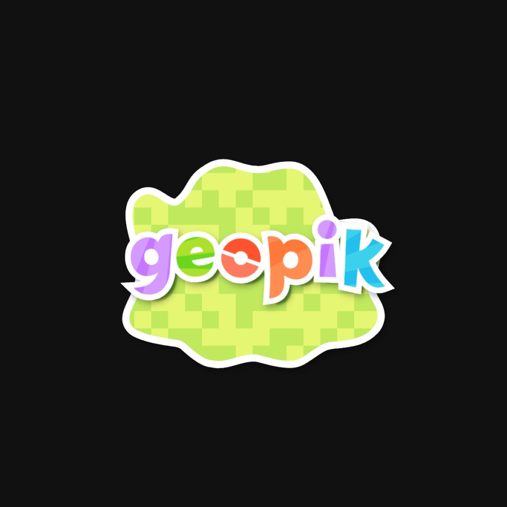
The font’s “blob” silhouette, used in the logo generator, resembles a soft, amorphous terrain patch or Ditto‑like form, giving the generated logos a playful, almost geological contour.
Example Usage
The GeoPik Museum logo itself has been generated using the Pokopia font, demonstrating how the typeface can be adapted into a geological‑themed brand identity. The rounded, pebble‑like letterforms and the soft, organic background shape echo the museum’s focus on natural forms, mineral textures, and playful scientific exploration.
Collector’s Notes
Although Pokopia is not a physical card or historical artefact, it plays a meaningful role in the visual ecosystem of Pokémon culture. Its rounded, inflated letterforms evoke the appearance of weathered pebbles, tumbled river stones, and softened geomorphological shapes — forms shaped not by chisels or fractures, but by time, erosion, and natural smoothing processes.
The thick outlines and layered shading mimic the effect of mineral banding, where contrasting layers of colour form through repeated deposition. The gradient options in the logo generator resemble opalisation and fluorescent mineral surfaces, making the font surprisingly compatible with the geological themes of the GeoPik Museum.
The “blob” background used in the generator can be read as a stylised igneous intrusion, a patch of molten material that has cooled into a rounded mass. Its Ditto‑like morphology reinforces the idea of material that is soft, malleable, and capable of taking on new forms — a fitting metaphor for typography itself.
As a digital artefact, Pokopia represents the intersection of graphic design, fan creativity, and material aesthetics. It earns its place in the museum as a modern tool that shapes how collectors, curators, and fans visually express their connection to the Pokémon world.